 吉見 博
Hiroshi Yoshimi
吉見 博
Hiroshi Yoshimi
"Boy" and "Girl"
K. AOKI
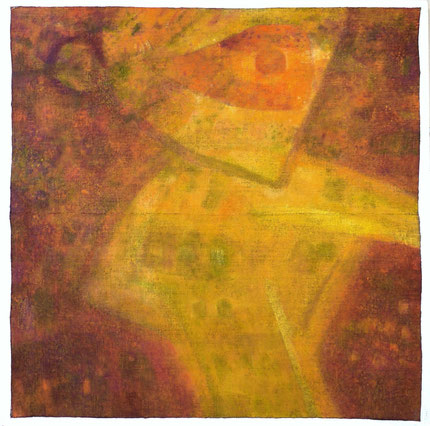
Simplified and abstract images of "Boy" and "Girl" are drawn in the center of the canvas. Viewer feels energy emanating like breath from the plane composition. Sophisticated techniques and color harmonization have shown artist's tireless efforts and accomplishments. His delicate aesthetic sense has created an aura of peace and harmony on the canvases.
I admire these works created by artist who truly enjoys and loves to create art. He found dungarees as canvas material and has successfully experimented to make best use of its coarse texture. Colors have deepened and brighten. Using this canvas he has been creating a series of works that give viewers the embraced sense of warmth.I look to the future art of Mr. Yoshimi who has been brilliantly creating art works.
「少年」「少女」
青木健真
画面中央部に簡素化され抽象化された「少年」「少女」像が線描されている。そこから拡がる平面構成が息遣いとなって観るものに迫り輝きを感じる。洗練された技法、調和させようとする彩色の工夫に並々ならない努力の跡と達成感のような味わいある安らぎをにじませ、キャンバス全体と細部まで行き届いた繊細な美意識が微妙にマッチして主題を語ろうとする。
美術することの喜びと愛情あふれた清々しい作品だと思える。それにしても、キャンバスとしているドンゴロスと出会い、その大きなキャンバス目を最大限に活かした試みは成功だと思う。彩色はいっそう深みをまし輝きをまし、観る者を包み込むあたたかさのある作品群を生み出しているからだ。いま最も輝いている吉見氏のこれからにますますの期待をしている。

The solo exhibition of Hiroshi Yoshimi
Osamu ohno
Color sense is a natural ability. It is very difficult to acquire it by learning. I feel always envious of him whenever I see paintings of Mr. Yoshimi. He so naturally manipulates colors such a way that one may not realize his painting is indeed involving extremely exquisite techniques. For example, a small tempera painting of scenery in Venice is just a jewel.The main subjects of painting for Mr. Yoshimi have always been humans and their surroundings. I can see in his large works many traces of painstaking efforts that I admire. If I start describing in detail the creative theory of Yoshimi's painting, the space of paper given here is not enough. In short, his work can be summarized as elaborate repetition of condensation and diffusion of forms, and uncompromising efforts for rearrangement.For example, the work that was awarded the Grand Prix of the Jiyubijyutu Exhibition in 2004 that he used tempera together with oil, and “Pigeon” and “Girl” in this exhibition; subtle and beautiful colors first catch your eyes. Then, condensation and diffusion of forms and colors start to close up with elaborate balances. Picking up any of his paintings, none has a trace of careless work. Strong plane compositions, beautiful colors, yet, underneath of that surface, there are elements that are slopping around, and that is one great charm of his paintings.
吉見 博 個展
大野 修
色感の良し悪しはその人の天与のもので後学の学習努力によっても如何ともし難い。私は吉見さんの作品を見ていつもうらやましく思う。作画する者にとって、道半ば五合目から登るようなもので、テンペラで描かれた小品のヴェネッツィア風景など、これは宝石だ。
吉見さんの主モチーフは自由美術展初出品の時から人間とその周辺で、今もって変わらない。大作のそれぞれも苦心の追求の跡が見られて、おお!やっているなと私の中の同感をよぶ。吉見絵画の論を詳しくそして広げると、与えられた紙数をはるかこえてオーバーフローとなるので、くくって言えば形の凝縮と拡散の往復、その繰り返しの推敲があって作品を強固なものにしている。
油彩とテンペラを併用した2004年の自由美術賞の作品。個展のPigeonや少女など、美しい色面がまず初めに目に入ってきて、次第に形の凝縮と拡散、色彩が微妙なバランスの上に立って迫ってくる。それから、多分にご自身の性格からもきているのだろうが、粘着質と言っては悪いが、完璧性の強い人だと思う。成功、不成功にかかわらず、どこをとっても作者があいまいに放り出した跡が無い。強固な平面、美しい色彩、しかし内実はゆれにゆれていて、それも魅力だ。絵を描くのも、見るのも、ますます難しいこの時代。神経と体力を磨り潰す作業が多いと想像するのだが、どうか変わらずに! 吉見さん、いちどゆっくり、一杯飲みながら、森羅万象、お話を聞かせてほしい。